Print Work
While the Web has permanently altered print’s role in our life, print will still be around for a long time. Print is tangible, it’s real, it has weight and dimension. It can communicate value before the content is even read. It has a history and visual vocabulary that the Web can’t touch. The Web wont kill print, just redefine it. Print is dead. Long live print.
tech bridge west folder and brochure

Folder (left) and brochure (right).
The folder and brochure worked in conjunction with each other to promote Tech Bridge West’s unique ability to bridge the technological challenges inherent in new product development with marketing know-how to bring consumer food products to market faster.
Bronx Zoo Children’s mask

Hand-drawn children’s mask for a special event at the Bronx Zoo.
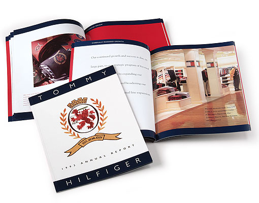
Tommy Hilfiger Annual Report ’93

Putting together your first annual report can be very intimidating; and that's exactly what was facing the Tommy Hilfiger Corporation. Staying with the familiar, the Tommy Hilfiger logo was used as the basis for the design.
Pension Planner

Follow-up brochure within an enclosing folder: cover and interior spreads.
Pension Planners wanted to find independent financial services professionals who were energetic, dynamic, and ready to take their careers to the next level.
To recruit these professionals, a campaign based on popular game and reality shows (with prizes) was created. The campaign included a informational brochure with an enclosing folder (above), three direct mail brochures, and a website.
Millennium Advertising Product Catalog

Millennium Advertising product catalog: cover and interior spreads
This product catalog was used as a sales/capabilities/product brochure to sell marketing materials to the financial services market.
Brooklyn Bancorp inc. Annual Report ’94

Brooklyn Bancorp Inc. Annual and Quarterly Report covers.

Brooklyn Bancorp Inc. Annual Report interior spread.
The Brooklyn Bridge was the design inspiration for the 1994 Brooklyn Bancorp Inc. Annual Report design. A cropped close-up quadratone photograph of the bridge highlighting the abstract patterns made by the supporting cables of the bridge symbolized the bank’s commitment and connection to the community.
The interior grid uses a main column of text with photos and graphs “hanging” from of the main column, much in the same way the deck of the Brooklyn Bridge hangs from the support cables. The various tints and shades of blue were derived from the Bank’s logo.
Bowne Inc. Invitations
Bowne Inc., hosts numerous events throughout the year to celebrate civic events in New York City and company milestones.

A party invitation to celebrate the recent acquisitions made by the Metropolitan Museum of Art.

“Some Like It Hot” party invitation.

Mardi Gras party invitation.
The Investment Center

Informational brochure interior spread.
The Investment Center wanted independent financial services reps to “Discover the Difference.” This informational brochure with an enclosing folder was part of a campaign to recruit these professionals.
Additional elements of the campaign included three direct mail brochures, a direct mail postcard, a comprehensive website and three trade ads.
Bowne Inc. Annual Report ’94

Bowne Inc. Annual Report ’94 cover.
The Bowne Inc. Annual Report 1994 departed from previous years with its extensive use of illustration. Bowne wanted to convey that quality print communication (this was pre Web) was as vital to the success of your business as the quality of the products and services you provided.
Bowne Inc. Annual Report ’93

The Bowne Inc. Annual Report 1993
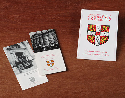
Cambridge University Fundraising Campaign

Cambridge University Fundraising Campaign collateral pieces.
Peter Montoya Inc. - One Year Marketing Plan

Peter Montoya Inc. – One Year Marketing Plan: cover and interior spreads.

Wire bound book with three, full-color tabs. The visuals were meant to express process and the passage of time.
Cantor Fitzgerald & Co. Invitation

Cantor Fitzgerald & Co. invitation.
The party was held at the Sea, Air and Space Museum on board the USS Intrepid, located in New York City. The flag signals spell out the word P A R T Y.
Provue Development

ProVUE Development informational sales sheet and trial kit for its program SiteWarrior.
C. P. Carry CIP / CPA 12 Annual Reports

C. P. Carry CIP Annual Report cover and interior spread.

CPA 12 Annual Report cover and interior spread.
Annual reports for two real estate investment trusts.
About Andrew
For over 20 years, Andrew has been helping businesses communicate more effectively with his awarding-winning work.
Andrew is active in the design community as a member of AIGA. He is also working for a more sustainable future by adhering to the principles of Design Can Change Initiative and is a founding board member of the Sustainable Business Leadership Council.
Partial Client list
Accountants Financial Alliance
Proud Member
Founding Member
SBLC. Advancing sustainable business practices through networking, education, and certification.


